Introduction
Glass bottle decoration gives a brand more ways to create a recognizable pack than changing the glass shape alone. A subtle frost, a precise print, a saturated coating, or a metallic accent can transform a familiar bottle. Yet each process has its own visual limits, cost structure, and quality checks. This guide explains how to choose among common decoration methods and how to brief a supplier for a result that can be repeated in production. It is written for fragrance and beauty packaging, though the decision framework also applies to other categories. Start with the desired customer experience and functional constraints. Choose the process that supports them, then validate the actual finished bottle. A rendering is a design conversation, not a production approval.
Decide what the decoration must achieve
Write a short statement describing the role of the finish: improve shelf recognition, make the formula visible, create a tactile feel, provide brand information, or coordinate several shapes. These aims lead to different choices. A clear bottle with minimal screen printing keeps the liquid central. A full-colour coating makes the glass a stronger brand surface but hides the contents. A small foil detail draws attention without dominating the pack. Define the expected handling and distribution conditions too. A bottle sold in a protective carton has different abrasion exposure from one displayed without it. Agree on the visual hierarchy before requesting samples. The decoration should clarify the product, not compete with labels, closures, and the shape of the glass.
Screen printing for integrated graphics
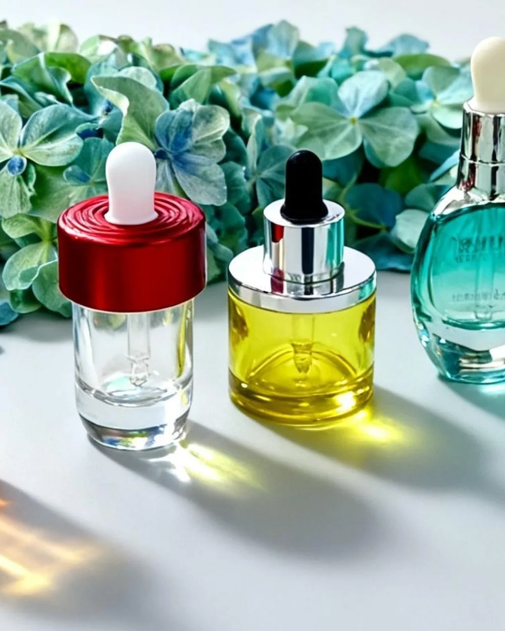
Screen printing places artwork directly on the glass and can give a clean, deliberate appearance. It is well suited to logos, simple typography, and graphics designed around the bottle's available print area. Curved shoulders, corners, and irregular surfaces can limit placement and registration. Ask for a printable-area drawing and identify where seams or changes in curvature sit. Small text should be checked at actual size. If several colours are used, discuss alignment tolerances and the order of layers. Request a physical proof on the selected glass colour because ink can look different on clear, amber, or frosted surfaces. Check adhesion and resistance to the contact the bottle will encounter in packing and use. An effective print design respects the physical object, rather than treating it as a flat page.
Frosting for a softer finish
Frosted glass diffuses reflections and changes how the bottle feels and photographs. It can soften a simple shape and make a series of products appear more cohesive. The effect can cover the whole container or be combined with clear areas and printed details, depending on the chosen process. Review how the finish affects the visible fill line and the colour of the liquid. A light frost may feel restrained; a heavier treatment may reduce transparency enough to hide product variation. Ask the supplier what process creates the reference sample and how consistency will be controlled between lots. Check whether handling leaves marks and whether labels adhere as expected. Compare samples under daylight, warm retail lighting, and studio lighting before committing to a final appearance.
Colour coating for strong brand codes
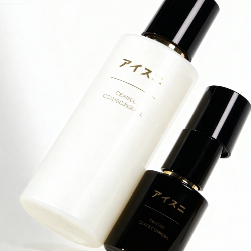
Sprayed or otherwise applied colour can create a broad range of looks, from translucent gradients to opaque matte surfaces. Colour should be specified against a physical target, with allowable variation agreed before production. Inspect coated bottles from multiple angles and at the edges where coverage can look uneven. Decide whether the inside or outside of the glass is decorated; this affects the visual result and the testing plan. Ask for adhesion, abrasion, and any relevant exposure checks on production-representative samples. A colour that looks beautiful in a single hero image may photograph differently at scale or against the final carton. Compare several bottles together, because consistency across a shelf matters more than one perfect sample. Document the approved finish with a signed reference and photography.
Hot stamping and metallic accents
Hot stamping can add a precise metallic or coloured highlight to logos, borders, or small design details. It works best when the artwork gives the accent room to be seen. Excessive fine detail can become hard to maintain on a curved or textured bottle. Ask about the available application area and whether the selected base coating or print is compatible with the stamping process. Examine the edge definition, placement, and adhesion of the accent on actual samples. Handle the bottle repeatedly and check for wear where fingers, cartons, or closures make contact. A small highlight can create a premium effect when the rest of the package is disciplined; it is less effective when several other reflective elements compete for attention. Keep the finish consistent across sizes where possible.

Combining methods without visual clutter
Two processes can work well together when each has a clear job. For example, a soft coating can establish colour while a limited print communicates the brand. A frosted bottle with a small metallic mark may feel distinct without overwhelming the formula. Before combining methods, ask the supplier for the exact process order and the effect on lead time, minimum quantity, and rejects. Each added step creates another opportunity for misregistration or damage. Prepare a layered artwork file that names each process and colour. Use a simple mock-up to decide hierarchy, then approve a physical preproduction sample. If the design depends on a very narrow registration tolerance, ask whether that tolerance is sustainable in volume production. A slightly simpler design can sometimes look more consistent and expensive.
Prepare artwork that survives production
Supply vector artwork where appropriate, with fonts outlined and all colours named consistently. Show dimensions and placement on a bottle drawing, including front, back, seam position, and intended viewing direction. Specify whether text needs to remain readable through the filled liquid or against a coating. Distinguish essential product information from decorative copy so technical and regulatory reviewers can check it. Request a proof at actual bottle scale, not just an enlarged computer image. The same word can look elegant on a large screen and unreadable on a small container. Ask the supplier to flag any line weights, gaps, or placements that exceed the chosen process. Keep version control clear; outdated artwork is an avoidable cause of costly rework.
Approve quality with measurable examples
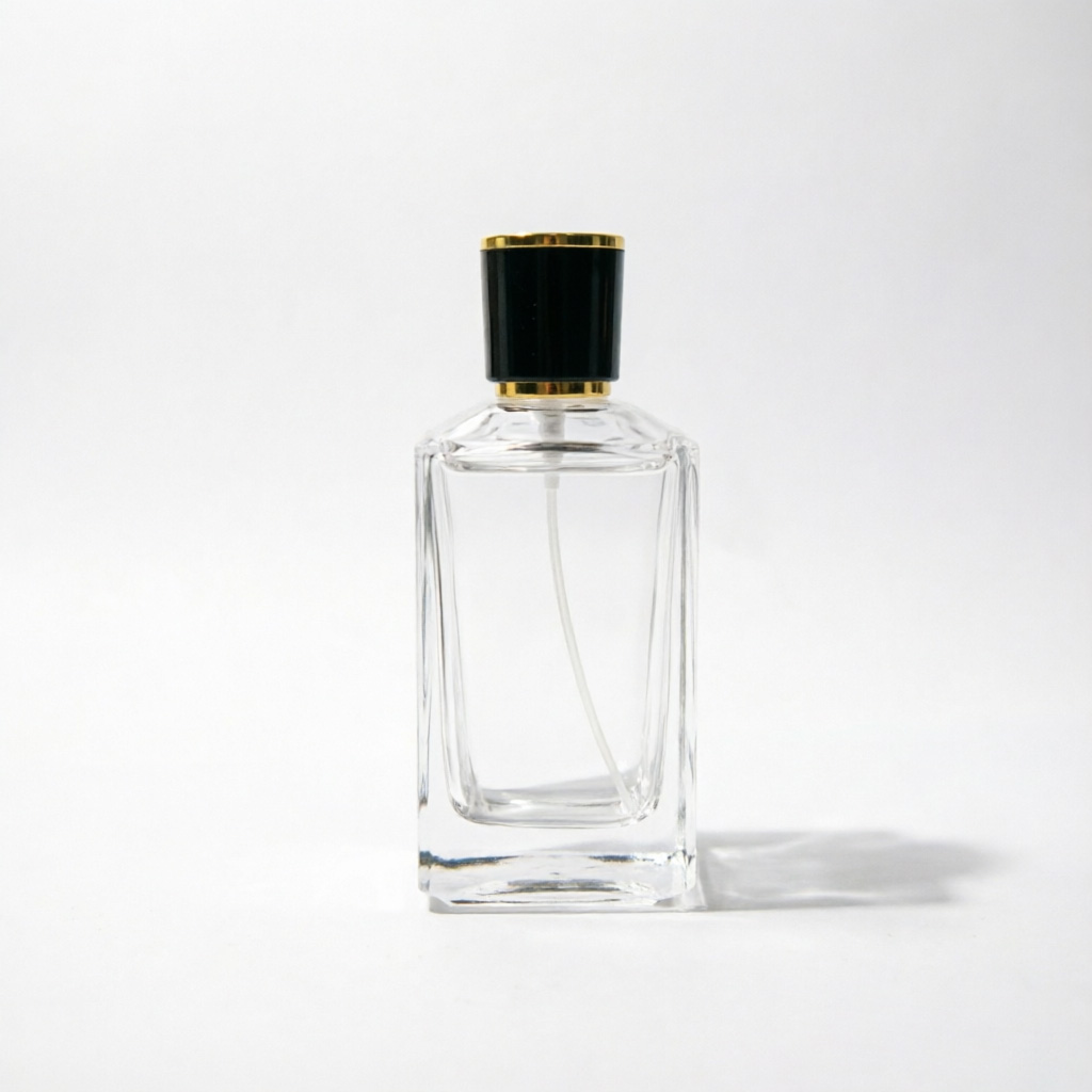
A visual specification should include acceptable colour variation, placement tolerances, coverage, print edges, and defect examples. Critical functional defects, such as a coating interfering with closure fit or filling, need separate attention. Inspect samples after packing and handling, not only as they leave the decorating line. If the bottle will be handled frequently, define an appropriate wear check. Retain reference pieces from the approved run and identify the production lot. Ask who inspects the undecorated glass, who checks the decorated result, and who is responsible if a finish hides a glass defect. Document the decision pathway when a batch is outside specification. Clear approval standards help the supplier maintain the intended look and help the buyer make consistent acceptance decisions.
Make the final choice in context
Place the decorated bottle with its cap, filled product, label if any, and retail carton. Check it in hand, on a shelf, in a photograph, and inside a shipping pack. Compare the total project cost, including proofs and rejects, against the visual benefit. An understated finish executed consistently may be stronger than a complicated treatment that varies across production. Ask for a timeline that covers artwork review, physical proofs, durability checks, and first-run inspection. Browse the glass packaging collection for shapes that suit your finish, then send reference images and process preferences through the project brief. The best decoration is the one customers can recognize and the production team can reliably repeat.
Questions to ask during a sample review
When the first decorated samples arrive, place several together rather than judging the best one. Is the colour consistent from bottle to bottle? Are marks centered relative to the actual glass seam and cap, not merely to a drawing? Does the finish still look intentional when the bottle is filled? Hold the bottle as a customer would and check whether the main artwork is obscured by fingers. Photograph the samples against the proposed carton and under more than one light source. Ask the supplier to identify which piece represents the expected production standard and which variations are normal. If the visual direction works but one detail fails, specify a single measurable correction and request another proof. A general instruction to make it more premium is difficult to manufacture. A revised target, placement dimension, or accepted colour standard gives both teams something concrete to approve.